Vices Checkout
A straightforward, accessible checkout form
Vices Checkout is a streamlined, database-driven, accessible checkout form optimized for fast conversions, designed to support any type of sales funnel with minimal setup. The new checkout flow enabled Vices to launch entire new sales funnels in days rather than weeks, with significantly reduced costs. The redesign led to a 50% increase in conversions and a reduction in cart abandonment.
Development Began November 2022
Launched February 2023


Scrolling Isn't Taboo On The Web
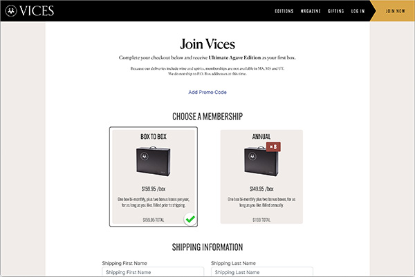
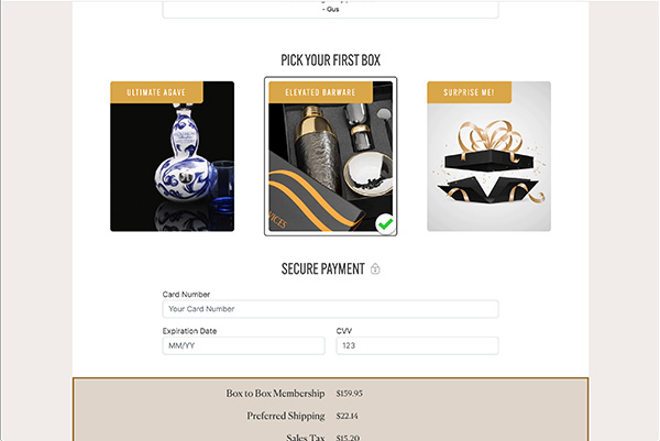
The old cart, rife with accordions and unnecessary toggles, was built with the outdated premise that users would avoid content that was “below the fold.” We found, instead, that users were overwhelmed by a set of hidden steps that made the checkout look more daunting than it actually was. My new design operated on the assumption that visitors already had an intent to buy and wouldn’t be intimidated by a few sections of a form. We made the product choices visually stimulating with subtle animation as a way of highlighting the experiential nature of the product, while making the rest of the form stylish but simple, so the user could easily fill out their information.
Challenges
Accessibility
The cart had accessibility issues that couldn’t easily be addressed with the existing structure. Vices even faced with lawsuits due to the non-accessible nature of the cart.
Usability
The initial checkout cart, developed by an outside agency, was complex, costly, challenging to update, and impossible to use with keyboard navigation. The design relied on multiple accordion steps that felt overly intricate for a checkout experience and included non-essential steps that introduced unnecessary friction.
Maintenance
Updating the cart with new items or checkout options was so labor-intensive that it required Vices to modify or even reject sales offers because the cart couldn’t support it.
No Source of Truth
Every time Vices wanted to update a featured product, a price, adjust quantities available, or any number of options, code for the checkout cart would have to be manually in every place it existed across the site. This caused numerous customer service issues when certain instances of the cart were inevitably missed, or manual errors occurred.
Process
Simplifying the User Journey
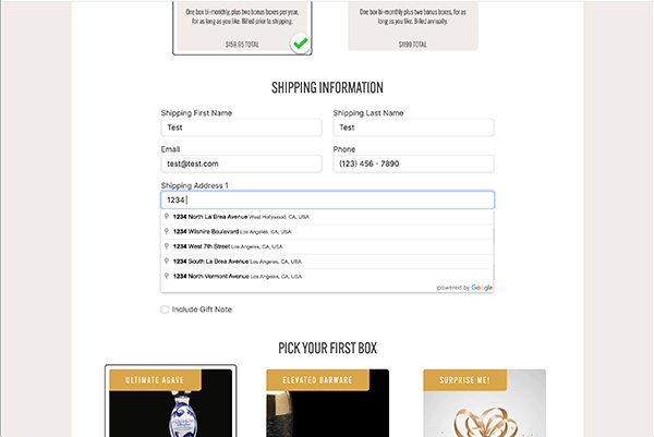
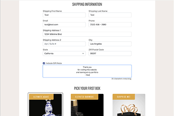
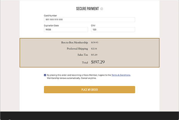
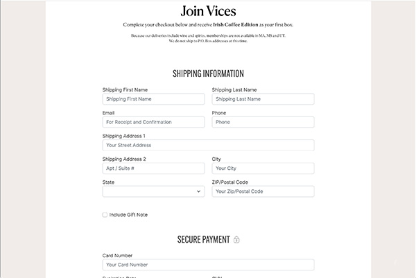
After analyzing the existing checkout flow, I introduced a straightforward solution: a single inline form that users could complete by scrolling vertically. Research and testing in other verticals showed that a vertically scrolling form could outperform complex, multi-step checkouts by as much as 50%. This design change removed unnecessary friction and focused users on the essential steps of completing their purchase.
Flexible and Configurable Design
Understanding that different sales funnels would have unique requirements, I built the checkout to dynamically hide options depending on the user’s journey to the cart. For example, if a particular option was already chosen earlier in the funnel, that step could be hidden in the checkout form, keeping the focus on only the relevant choices. This approach provided Vices with a streamlined, adaptable checkout that could be customized for different campaigns with minimal effort.
Optimized for Accessibility and Ease of Use
The new checkout flow was built to be fully navigable by keyboard, compatible with screen readers, and optimized for accessibility. Clear section headlines broke up the form to guide users smoothly through the steps.
Database-Driven
Product choices and configurations were placed in a database and creative assets were stored in a CDN, making it easy to integrate the checkout into any sales funnel and adapt content as needed.
Solution
Streamlined, Single-Page Checkout
Reflections
Improved Conversions and Reduced Cart Abandonment
The streamlined checkout flow led to a 50% increase in conversions and a noticeable reduction in cart abandonment, as users could complete their purchases with minimal effort and distractions.
Flexibility and Speed in Launching New Sales Funnels
By simplifying the checkout process and integrating with a database, Vices could launch new sales initiatives in a fraction of the time, reducing launch times from weeks to days, or even hours.
Cost Savings
The ability to update the checkout flow quickly and efficiently cut down on labor and development costs, providing the company with a more flexible, affordable way to test new sales funnels.
What I Learned
This project reinforced the importance of simplicity in checkout design, especially in environments where fast conversions are essential. Reducing the checkout process to a single, focused form allowed users to flow naturally through the steps, minimizing friction without compromising functionality.
Contact
Gus Watkins
UX, Digital Products, Digital Transformation
for SaaS, Dashboards & E-Commerce
- gus@guswatkins.com
- Phone
- (+1) 323 529 5110
- Online
© 2026 All rights reserved.
